Microchallenge 03
Designing for Interaction and Reflection
Too Long Didn’t Read
For our final MDEF microchallenge, Carlotta and I created an interactive display prototype to illustrate energy consumption issues. We built a dial stand and relay switch system that turned on appliances as the dial spun, aiming to engage users in reflecting on energy use. The setup included graphics showing global energy consumption, making the dial a powerful tool for visualizing power usage. The project was well-received, highlighting the importance of physical interaction in conveying complex ideas. We plan to refine this for MDEF Fest, focusing on the order of appliance activation to better illustrate the concept of essential vs. luxury energy use.
This was the final microchallenge of the MDEF course, this time around Carlotta and I developed an interactive display prototype to illustrate the issues of energy consumption that our project research is trying to address. We built a simple dial stand and relay switch system that would turn on a series of appliances one by one as a dial is spun, the entire idea was to create something that would get the user to interact with and reflect on the issues that our project is trying to address.
As before, we’ve documented the whole process in detail, and included all the code files and prototype schematics in a GitHub Repository which you can view by clicking the link below!
Setting a goal and making a plan
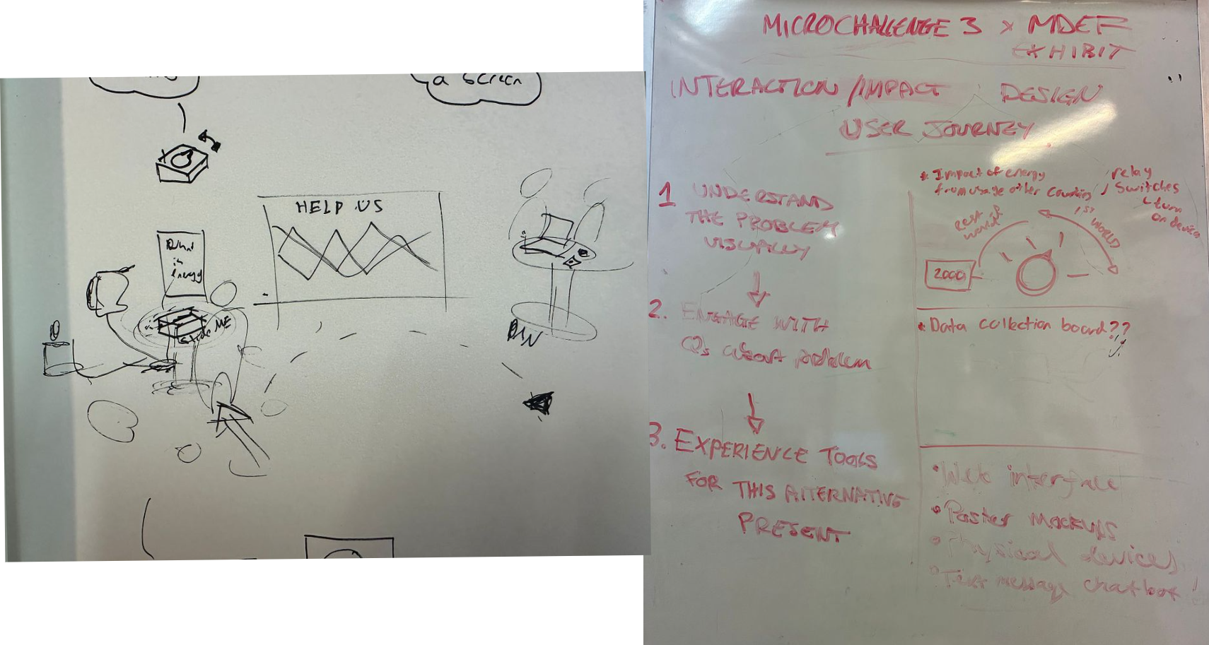
In the beginning we were completely unsure how we were going to fulfil the necessary physical interaction criteria of this challenge when we were so focused on getting our AI companion to function, but after Santi pointed out that we could focus on creating tools or prototypes to help in our exhibition for MDEF Fest we landed on the idea of an interactive display that would invite visitors to investigate the issue it was discussing. From that brainstorming session we came up with the following idea:
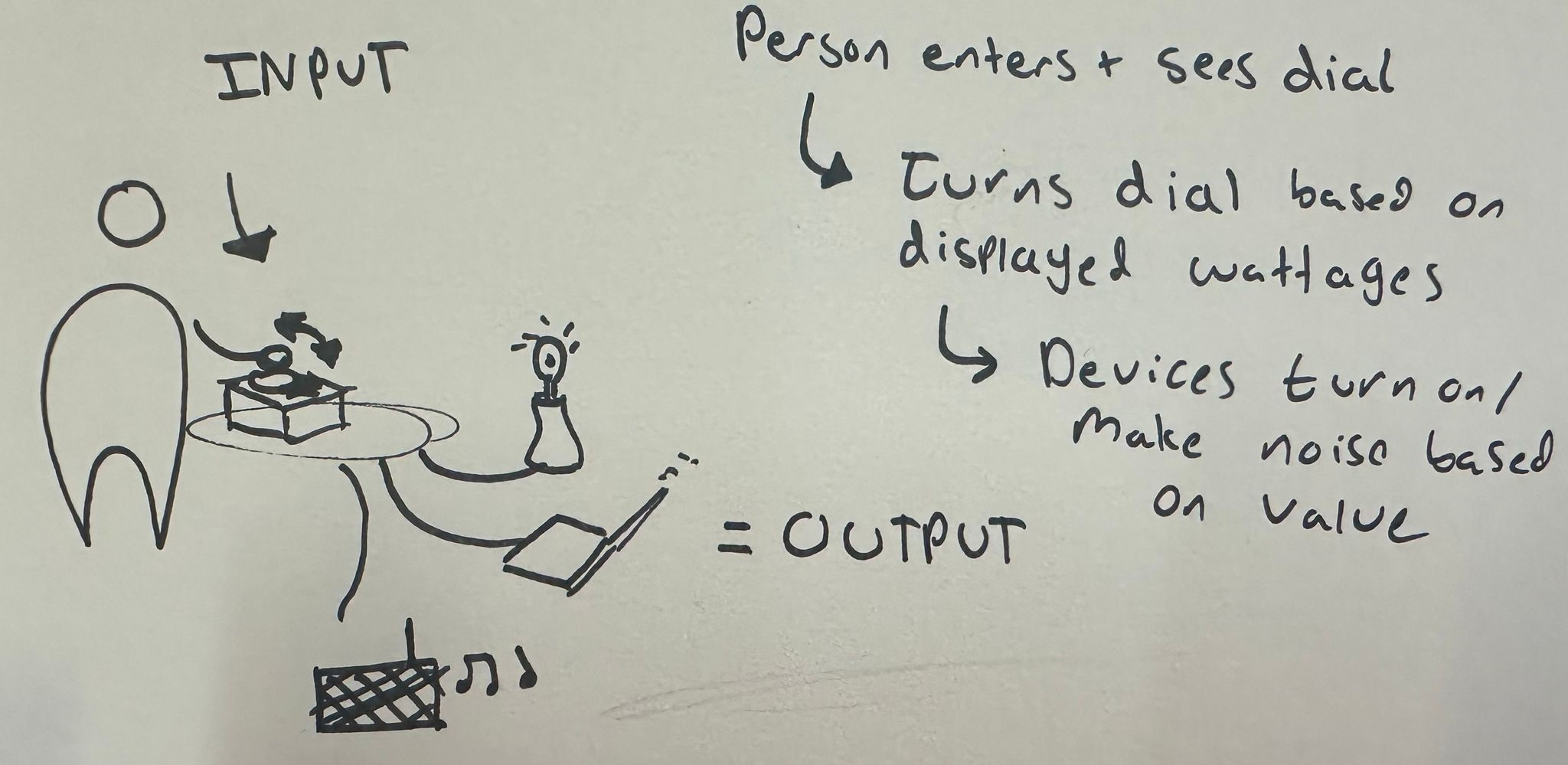
The defined input is: A dial in which people have the power to determine the amount of energy being released based on what averages of other countries is
The defined output is: A group of household electronic machines that start turning on in relation to the energy budget set as the input. All of these things will create an overwhelming feeling of input and things like a tv or radio will give feedback based on the energy problem to the person at the dial
The defined interaction is: A way for people to interact with what energy entails and how in modern society we use energy. The interaction should be physical and make use of various senses like hearing, touch, sight.
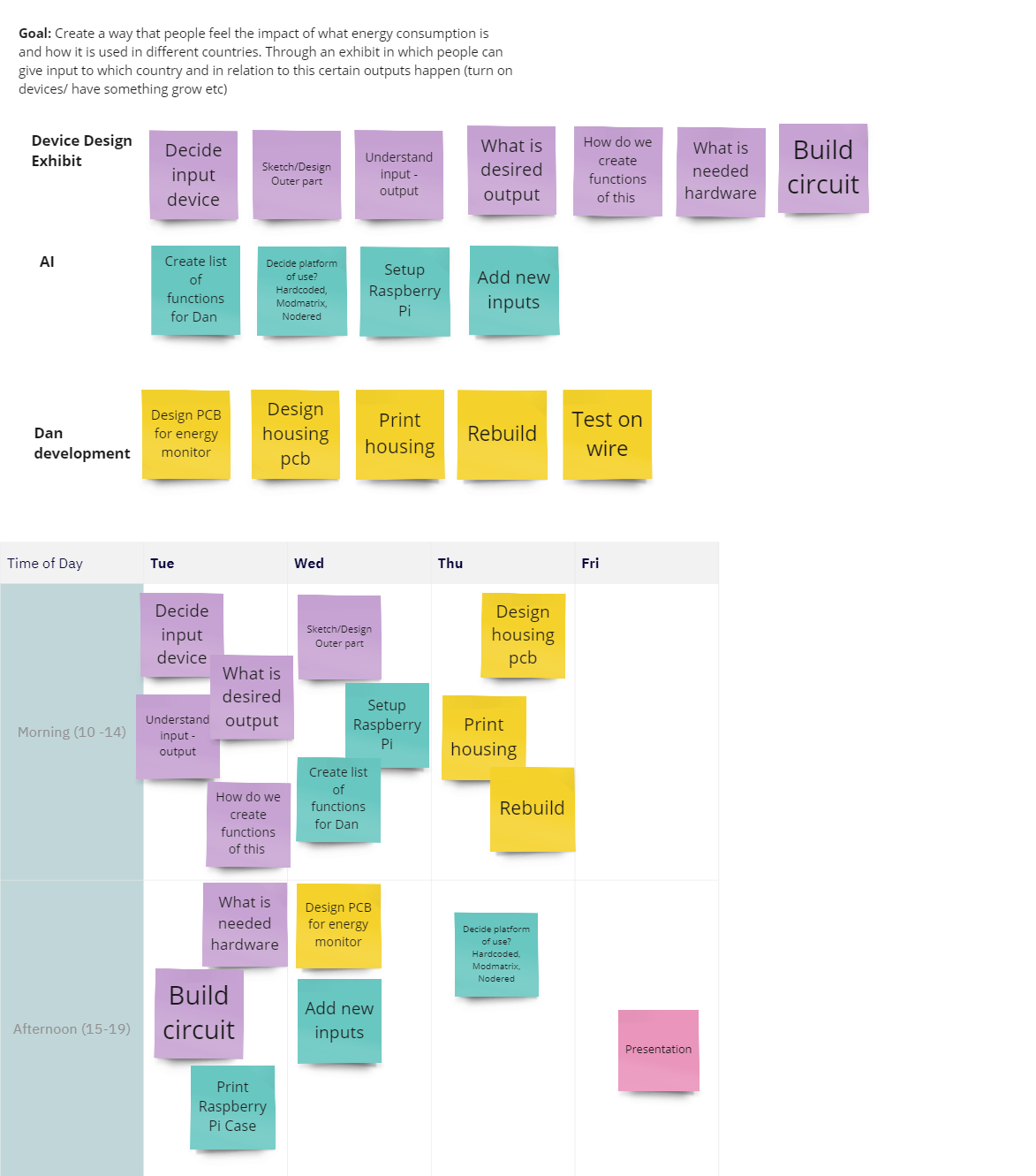
We divided our tasks into 3 distinct categories in a Miro board, divided them between each other, created a rough timeline for the 4 days we had for the challenge and set to work. We wanted to work mostly on hardware during this challenge and get as much done for the display part of MDEFFest so that in the coming weeks we can focus more on further device and AI development. This is why this week was more focussed on the display, however as we didn’t want to lose to much momentum we also scheduled moments to work on the AI infrastructure and PCB development for the physical devices of our design project.
How it works
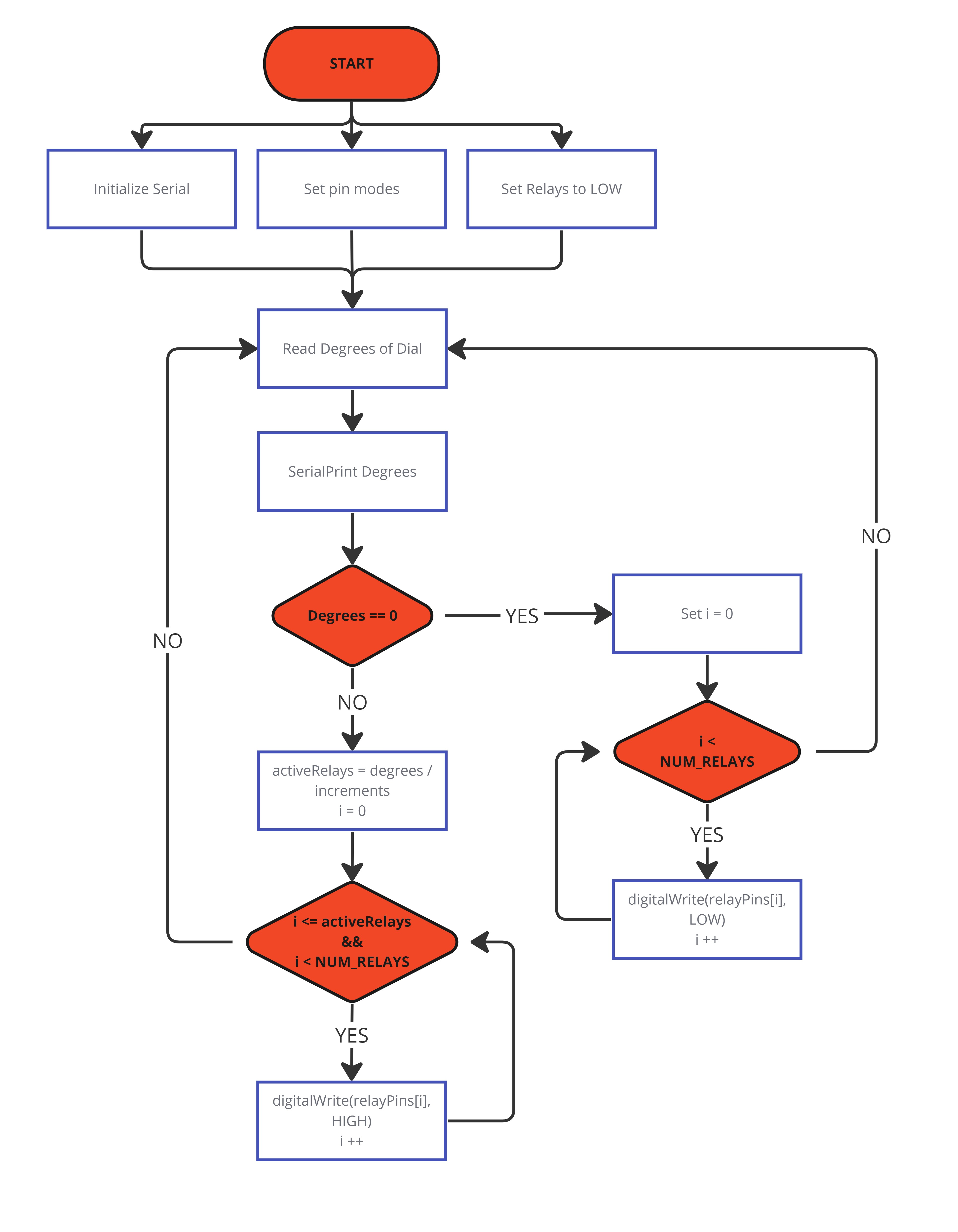
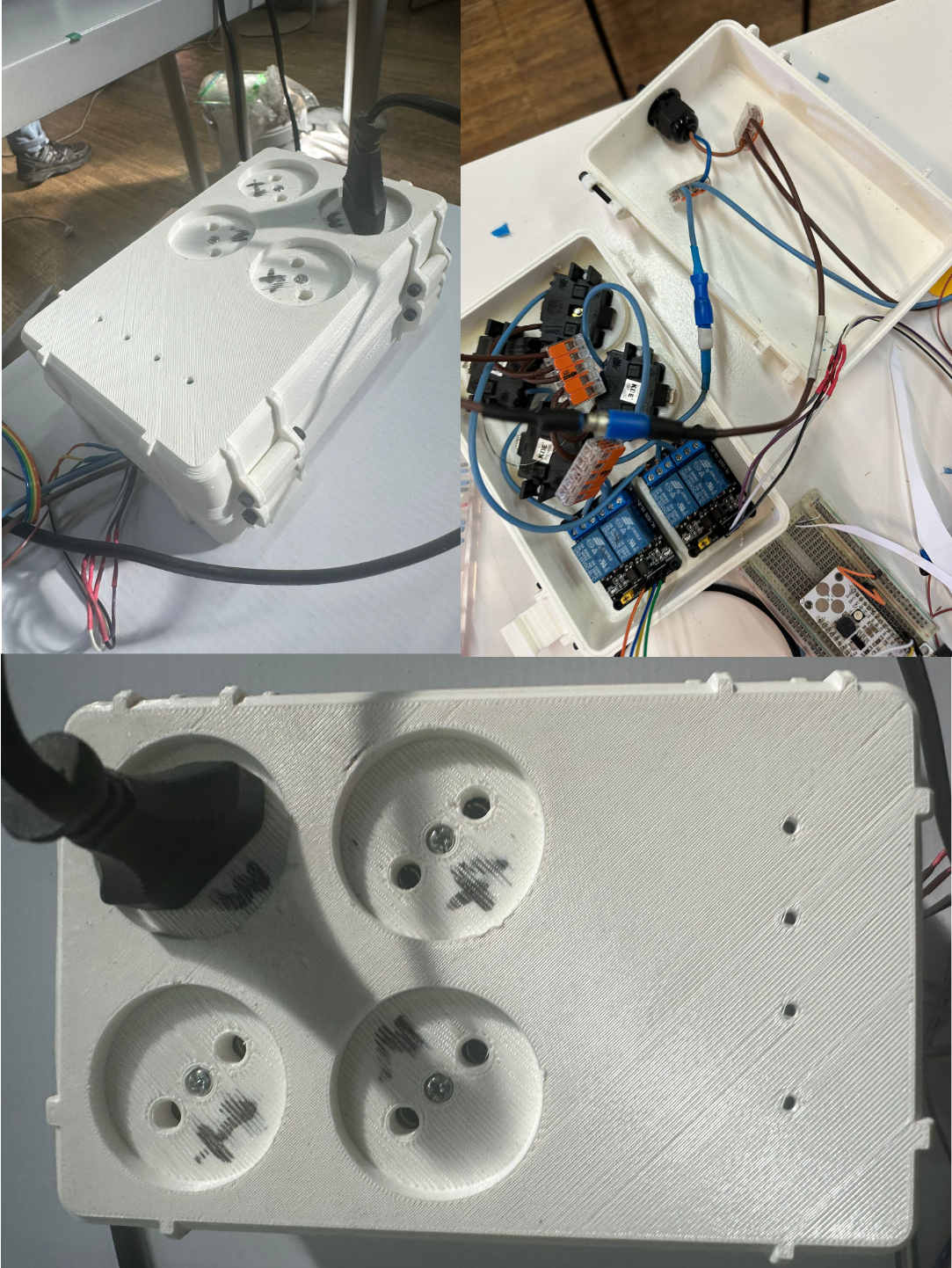
The circuit of this device was quite simple as it required a translation of a rotation of a dial into certain devices being turned on or off gradually. We brainstormed about different potential ways this could happen and it was determined that the best way was to use a potentiometer and several relays that are each connected to their own individual plug.
We mapped out exactly how the interaction was going to work in a flow diagram to give us a broad overview and visualisation of how exactly we were going to make it this work:
The final Outcome:
We ended up with our podium and dial connected to two relay boxes, these relays would turn on or off based on the angle of the dial potentiometer attached to the dial. As the angle increased more and more of the relays would turn on, powering up more and more electrical devices that we’d spread around the display.
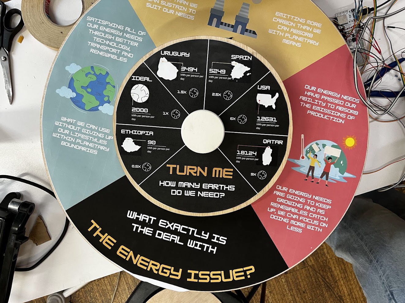
The podium and dial had graphics printed on them that illustrated the problem of energy overconsumption, as well as displayed just how much energy was being used by different countries around the world, and using a dial was a great way to illustrate how much power different nations were using as the dial turned past our recommended amount of 2000 watts per capita. It gave you the feeling of being able to turn on the power consumption of the world, which I thought was pretty cool.
Reflecting and Moving Forward
For this challenge we were happy to focus on a bit more hardware and physical interaction design, as the rest of our project really relies on people interacting with software based tools it was a nice change of pace. It also really got us thinking about the MDEF fest (the final showcase at the end of the year where we exhibit the research we’ve been working on) and how we were going to get people to interact with our display stand and understand the research we’d been working on.
It was nice to see that a relatively simple idea of a large dial that invited you to turn on the power to the world became so effective at illustrating the point of energy overconsumption. The entire idea behind our research is not to make individuals feel as though it is their fault that we are consuming so much, rather it is to galvanise them to reflect and want to take action, no matter how small. Watching members of our class interact with the dial and rad the information displayed, it was great to see that this was actually giving them pause and take a moment to understand exactly what the numbers of consumption meant. To that end it was really good to have the various appliances plugged in to create a form of overwhelming sensory experience to try and illustrate that. We received some really good feedback from that first showing and we are looking forward to implementing that into the final display.
The order in which the appliances are turned on is going to be very important, we are going to have to restructure it in such a way that the most essential appliances turn on first and scale to up to more and more convenience or luxury items that aren’t strictly necessary to survival but to a quality of life that we’ve become accustomed to. That’s going to be really important because if we can illustrate that the items that we deem “essential” aren’t necessarily so but we feel like we couldn’t live without them, then perhaps that would be enough to motivate people to stop and reflect on just how much energy they use and is embodied in them, and if there was a better way to keep using those conveniences but with a lower energy consumption bill.
That would be great, and is going to be the next step that we are going to focus on for the exhibit design of The WattWise Project.
